
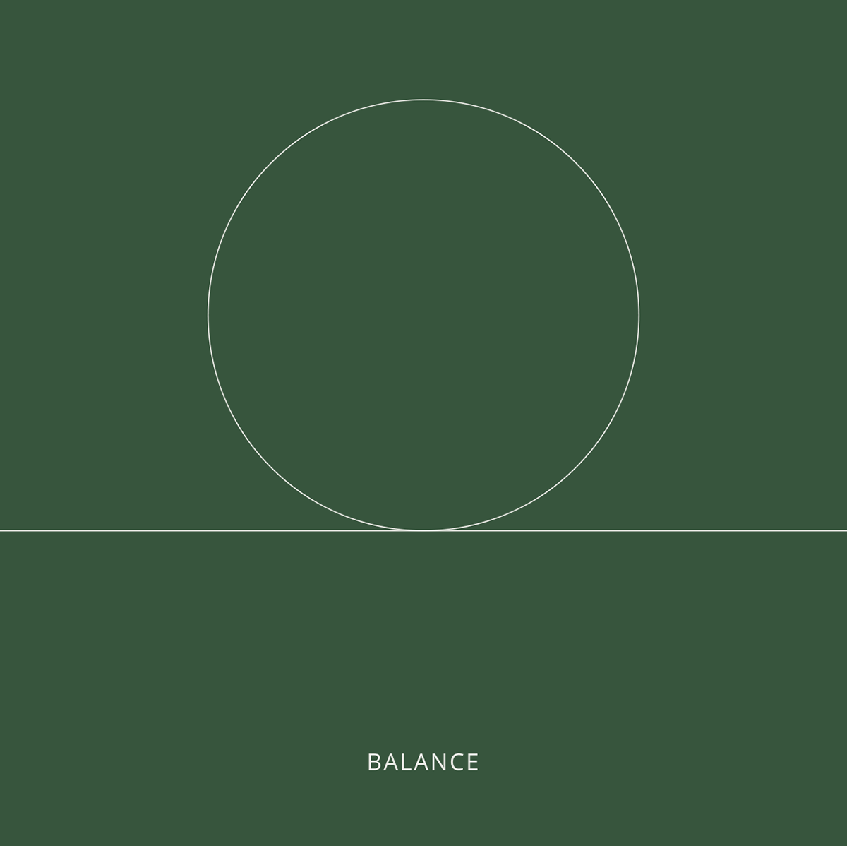
Inspiring a new
natural balance
The Context
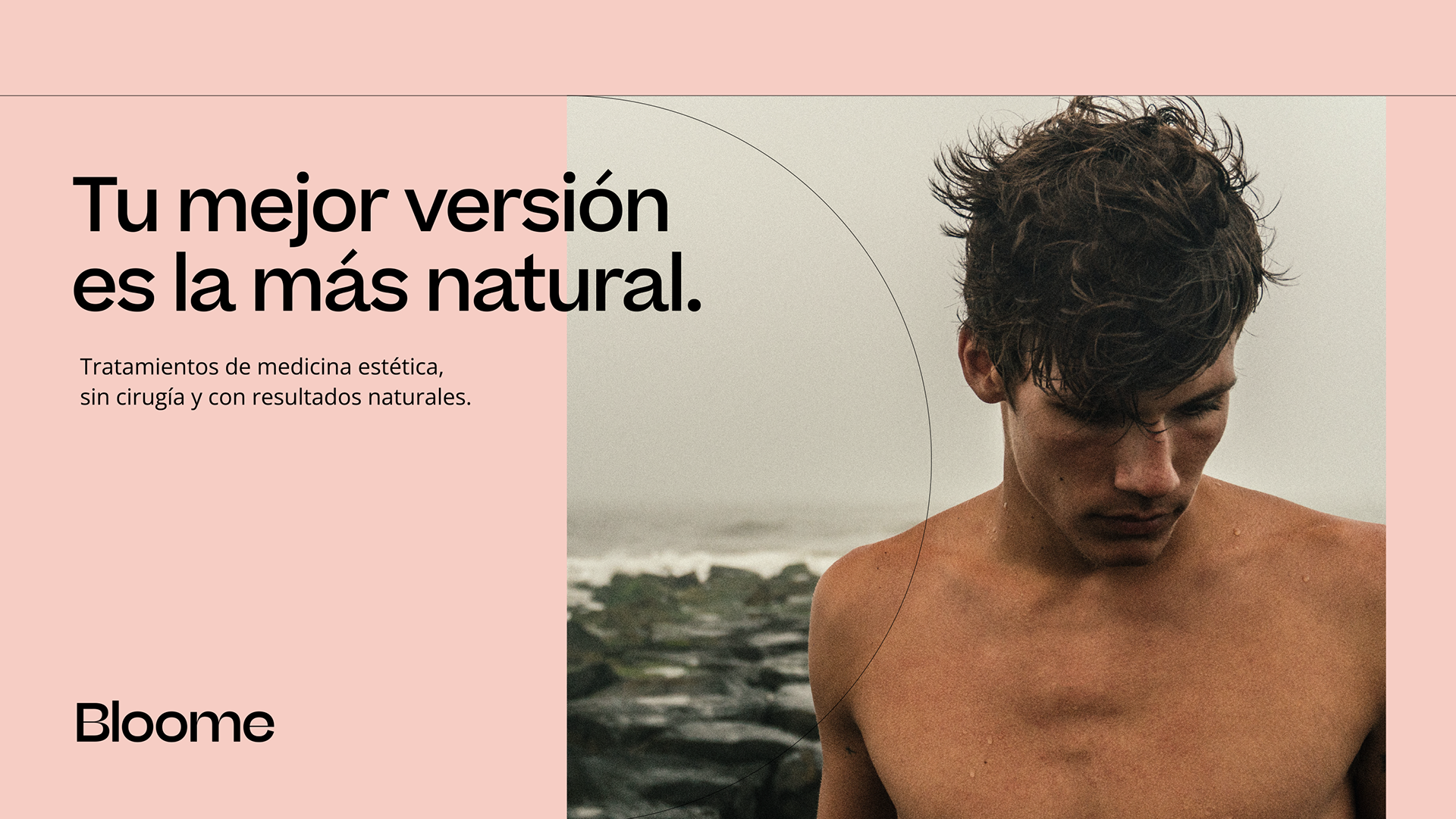
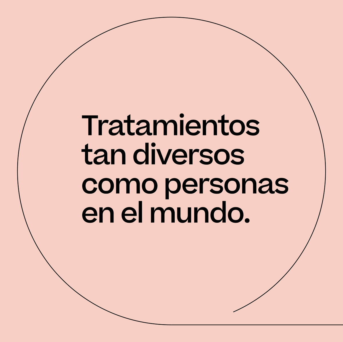
Bloome is a Barcelona-based startup that offers non-surgical aesthetic treatments with natural results. It was born to demystify aesthetic medicine and make it more accessible. Its goal is to invite people to feel good about themselves and be part of the Bloome world, inspiring a natural and enjoyable lifestyle.
Goals
Launched to establish a presence in the Spanish market, the brand aimed to differentiate itself from direct competitors. To work on this project, we focused on the concept of balance between the inner and outer aspects of the human being. We built the brand identity from scratch, centered on essential values such as balance, harmony, emotional well-being, security, and trust.
What we did
Strategy
Tone of Voice
Brand Identity
Visual Language
Print
Art Direction
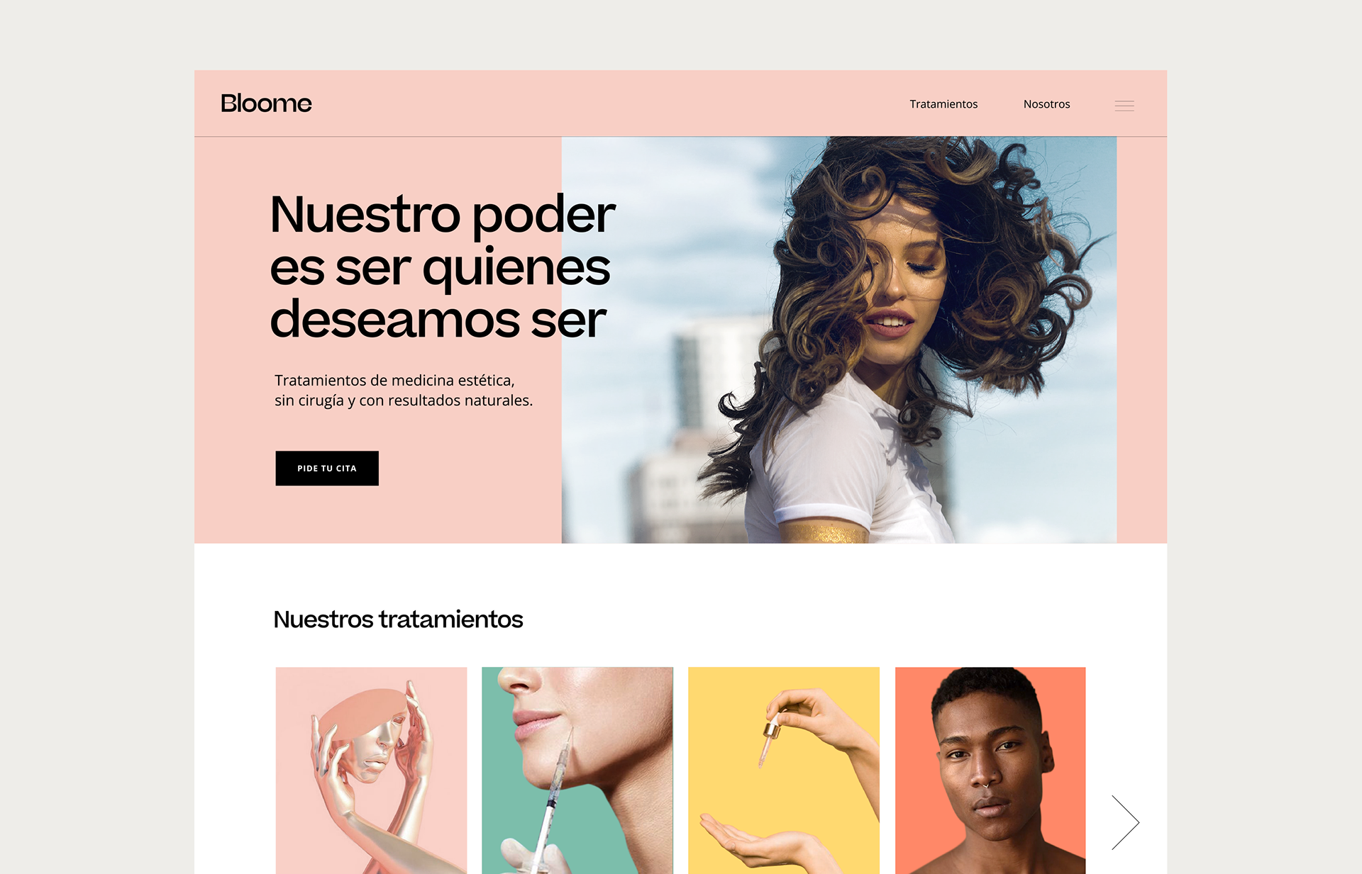
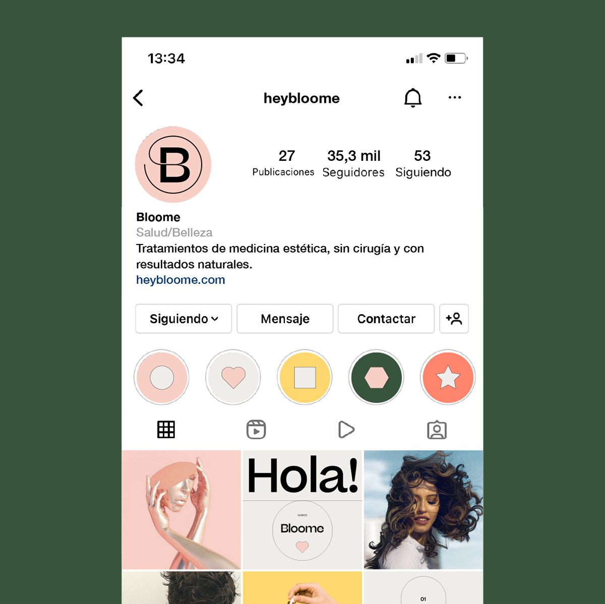
Digital
The impact we supported
Growth in 6 months:
+ Opening 3 stores (Barcelona + Tarragona + Girona)
+ 2 to 10 people working
The word as a concept
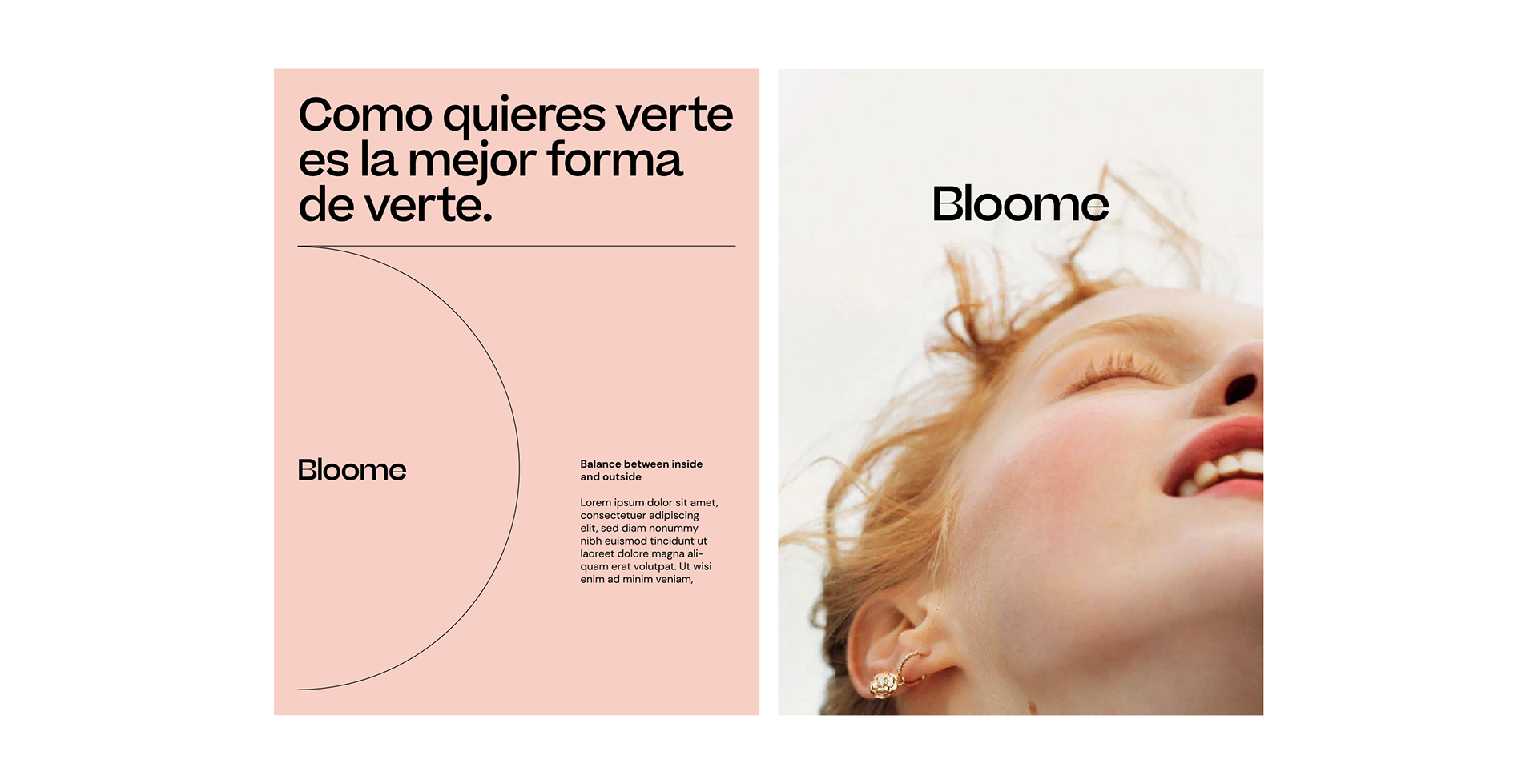
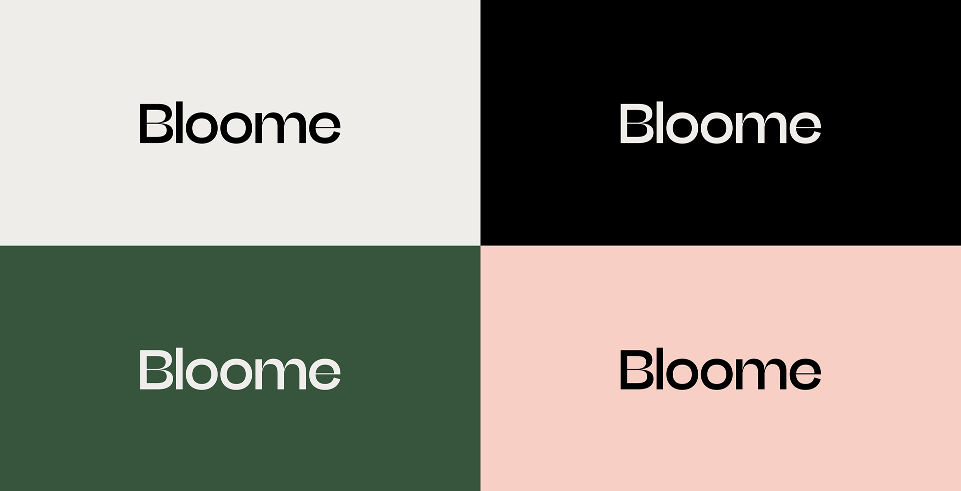
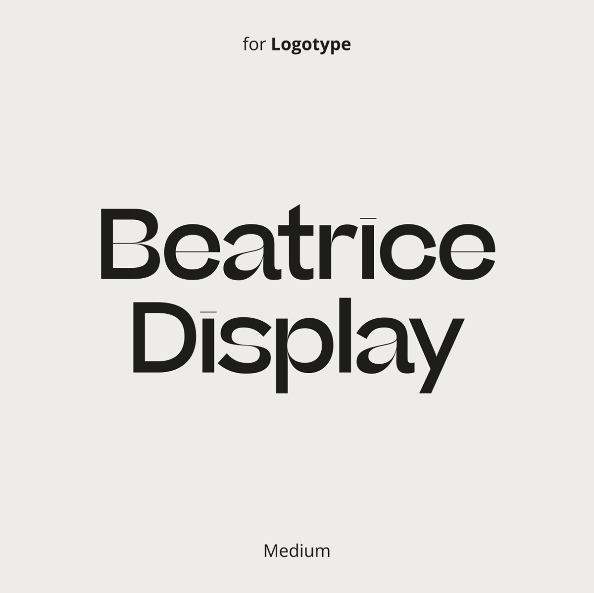
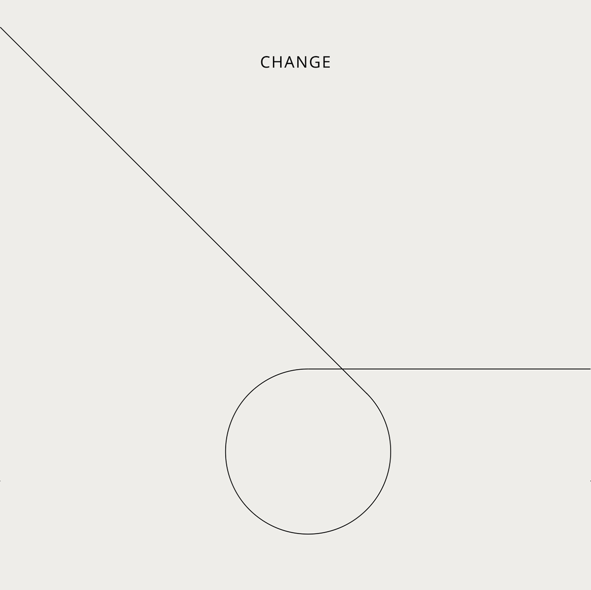
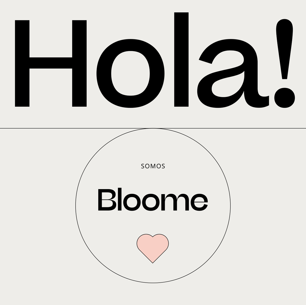
We think in a 100% typographic logotype to highlight the power of the word "Bloome", which is a blend between the ideas of "bloom" and "me". This way we communicate it as a concept in itself: the precise moment when a person wakes up and decides to make a change to feel and look better.
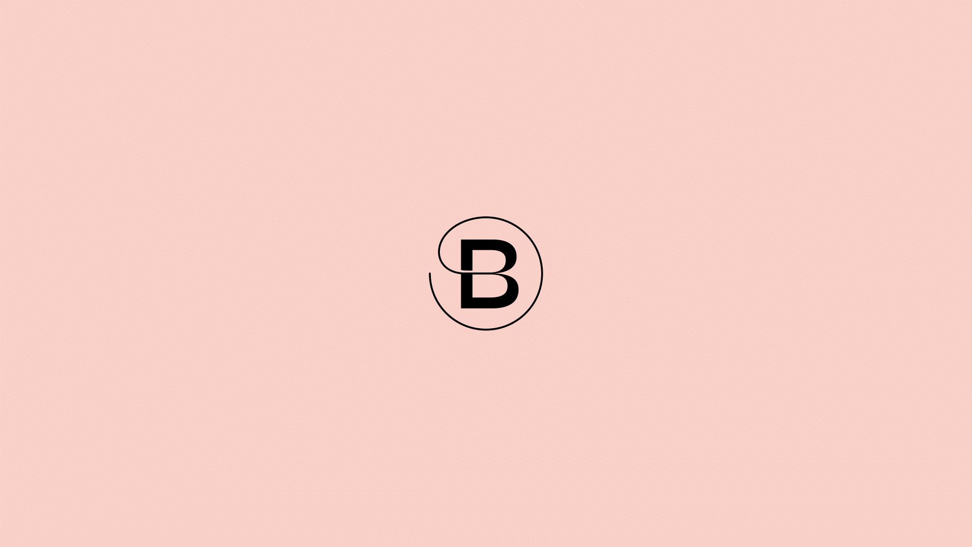
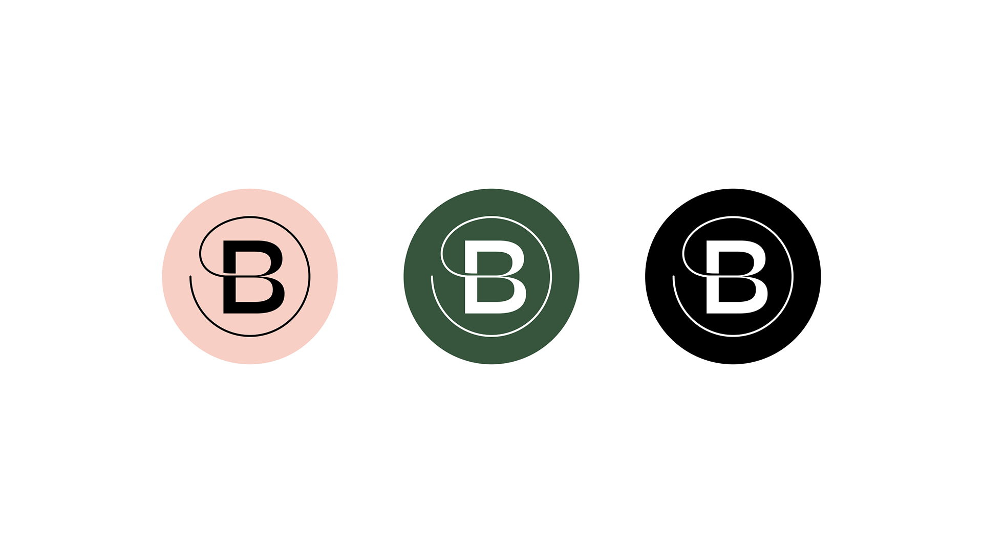
At the same time we worked on a reduced version (symbol), where the capital letter B is wrapped in itself in order to express this balance between the inner and outer world.
Typography & Colour
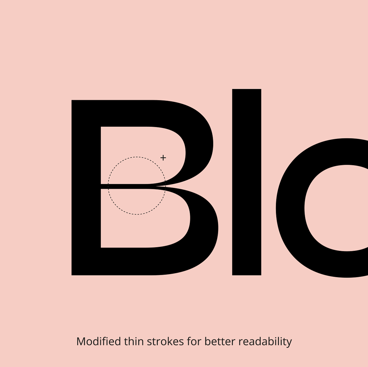
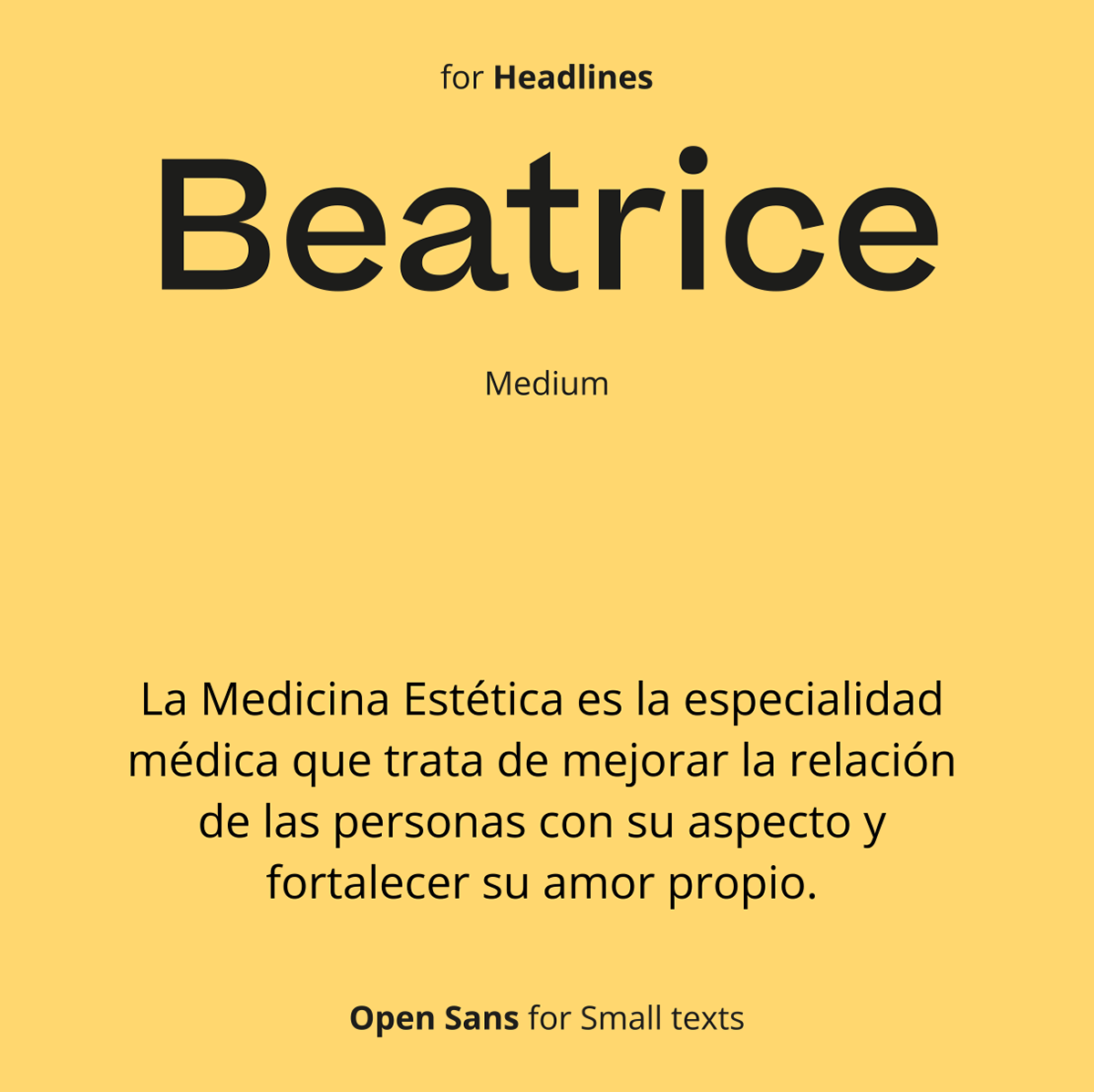
For the logotype we worked on the Beatrice Display font that contemplates thick and thin strokes, and helps us to communicate the idea of transformation.
For the headlines we chose Beatrice in its regular stroke version for better readability.
For the headlines we chose Beatrice in its regular stroke version for better readability.
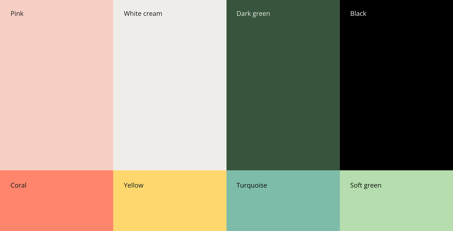
Bloome's colour palette is based on natural tones: pink and cream convey calm and harmony; green and black depth and security. The secondary palette is brighter and more saturated to balance with fresher and more cheerful touches, especially in digital.
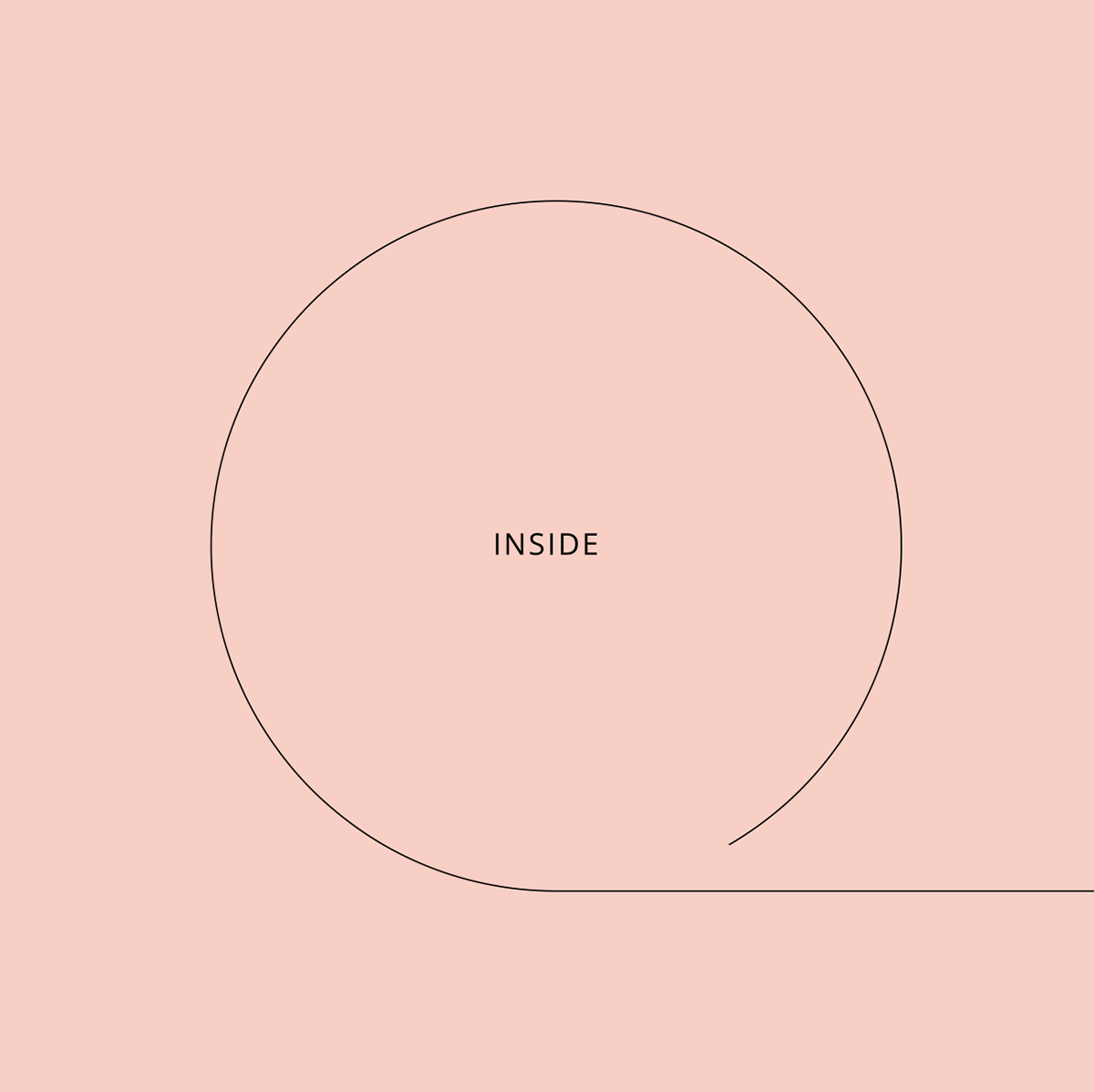
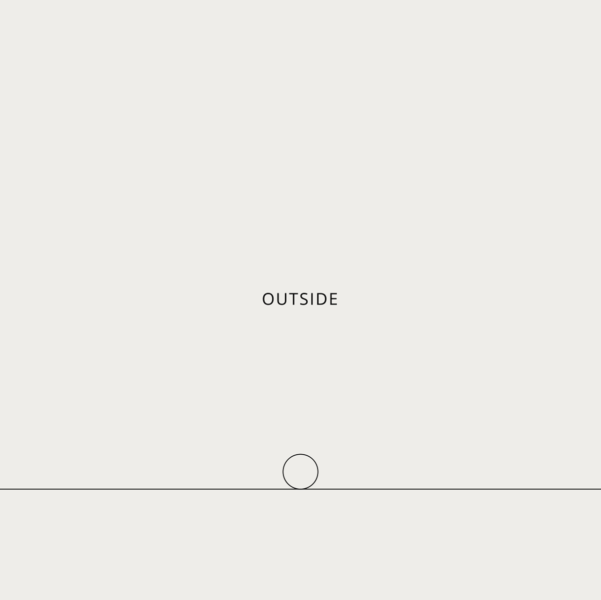
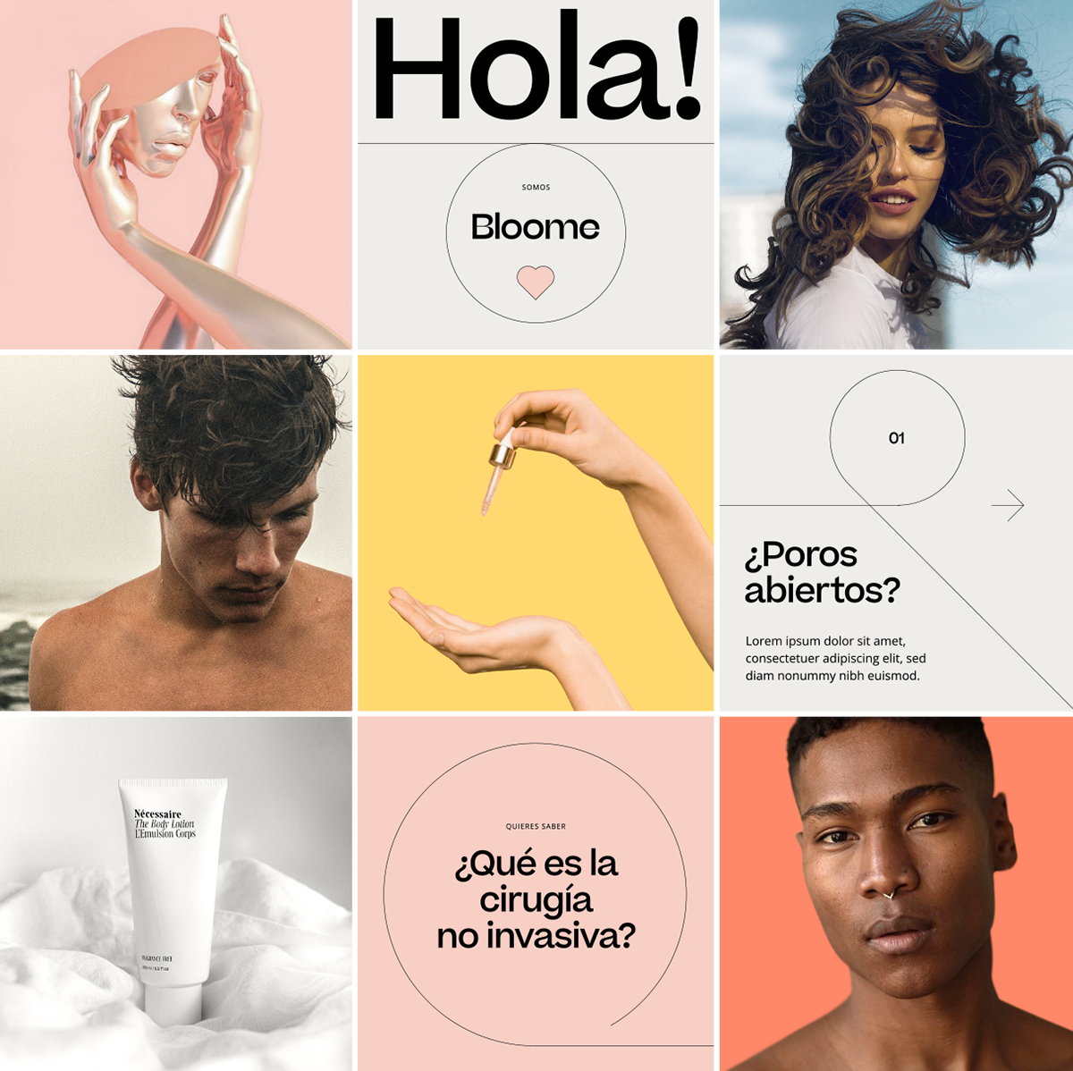
Visual language
As for the visual language, we worked from thin strokes in relation to the typography of the logo. These strokes play with the concept of inside / outside, forming circles that refer to the two "O" of Bloome.
Both the strokes and the circles will always seek to accompany and reinforce the communication, in a soft and balanced way.
Tone of voice
Bloome's tone of voice will have a triple challenge: to give confidence from a medical point of view, to demonstrate that Bloome has an expert medical team that endorses and guarantees the effectiveness of the treatments (rational dimension); to provoke attraction through language to build an aspirational desire towards the treatments and demonstrate their effect on physical and emotional well-being (emotional dimension); to generate a normalizing discourse of aesthetic medicine, to break down myths and taboos through education and sincere and transparent information. To open the subject to public dissemination and diffusion (social dimension).
Commercial communication
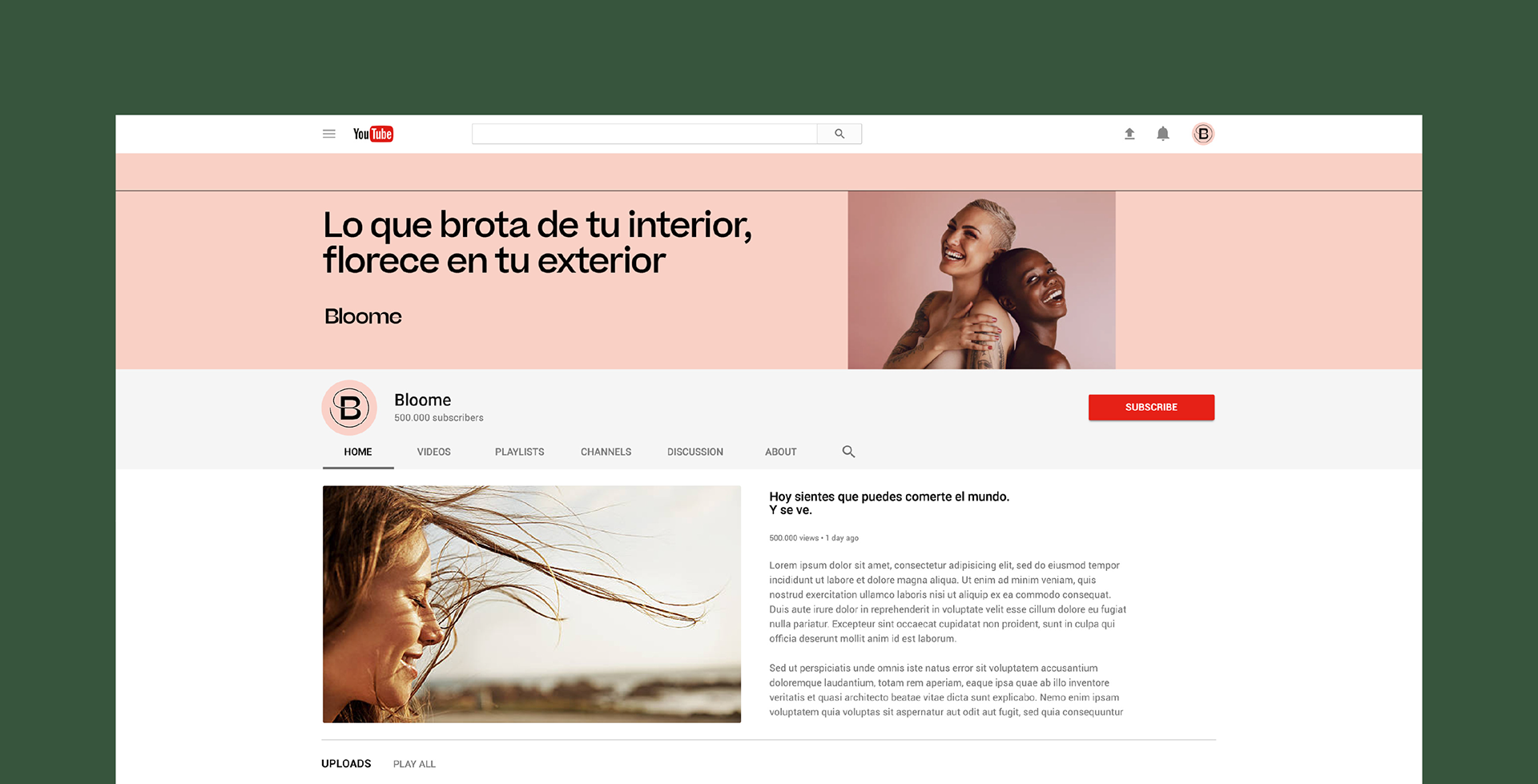
Bloome's commercial communication focuses in a first stage on the digital part, having its website as the gateway to its new world, and social networks as essential channels for the dissemination of its treatments.
On the physical side, Bloome begins its first steps in a pop-up store, and then continues to grow in search of a series of clinics of its own.
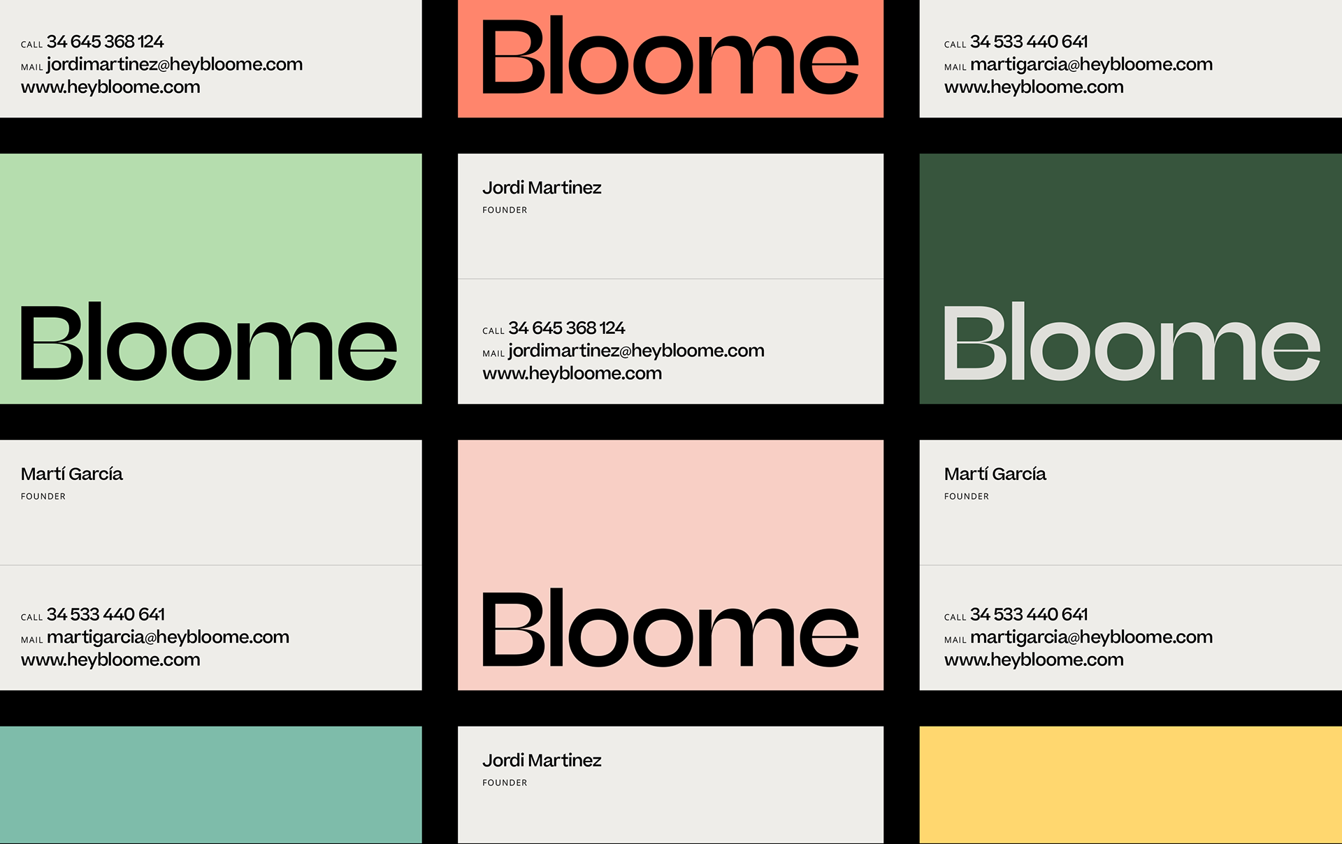
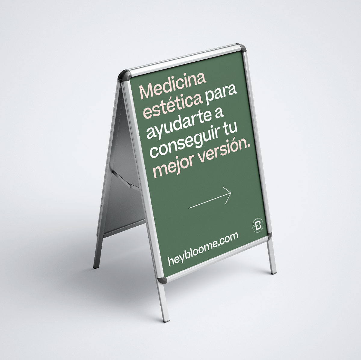
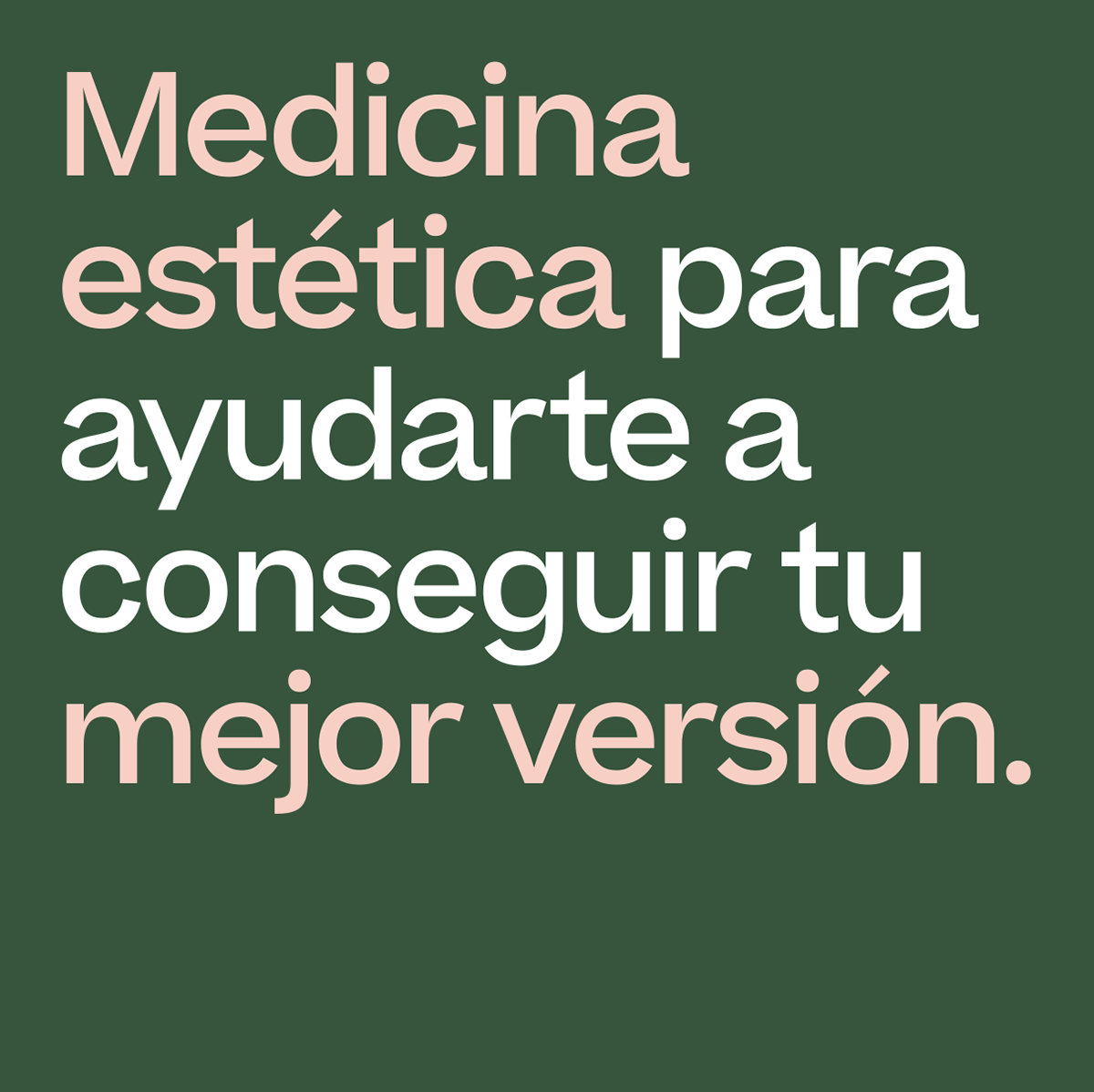
We designed a set of business cards, billboards for street campaign, and some pieces such as a welcome sign for their pop-up store.
On the physical side, Bloome begins its first steps in a pop-up store, and then continues to grow in search of a series of clinics of its own.
We designed a set of business cards, billboards for street campaign, and some pieces such as a welcome sign for their pop-up store.