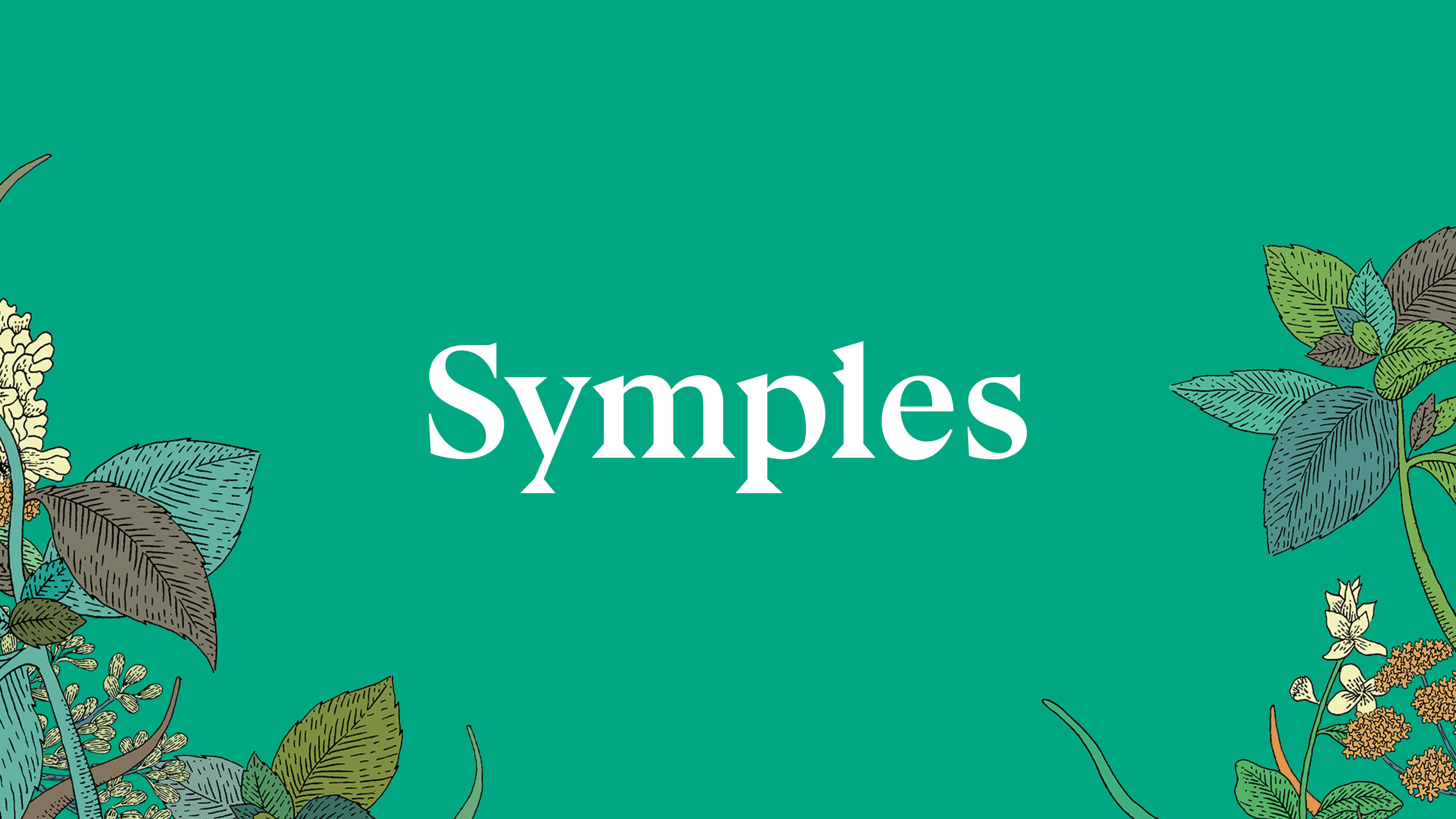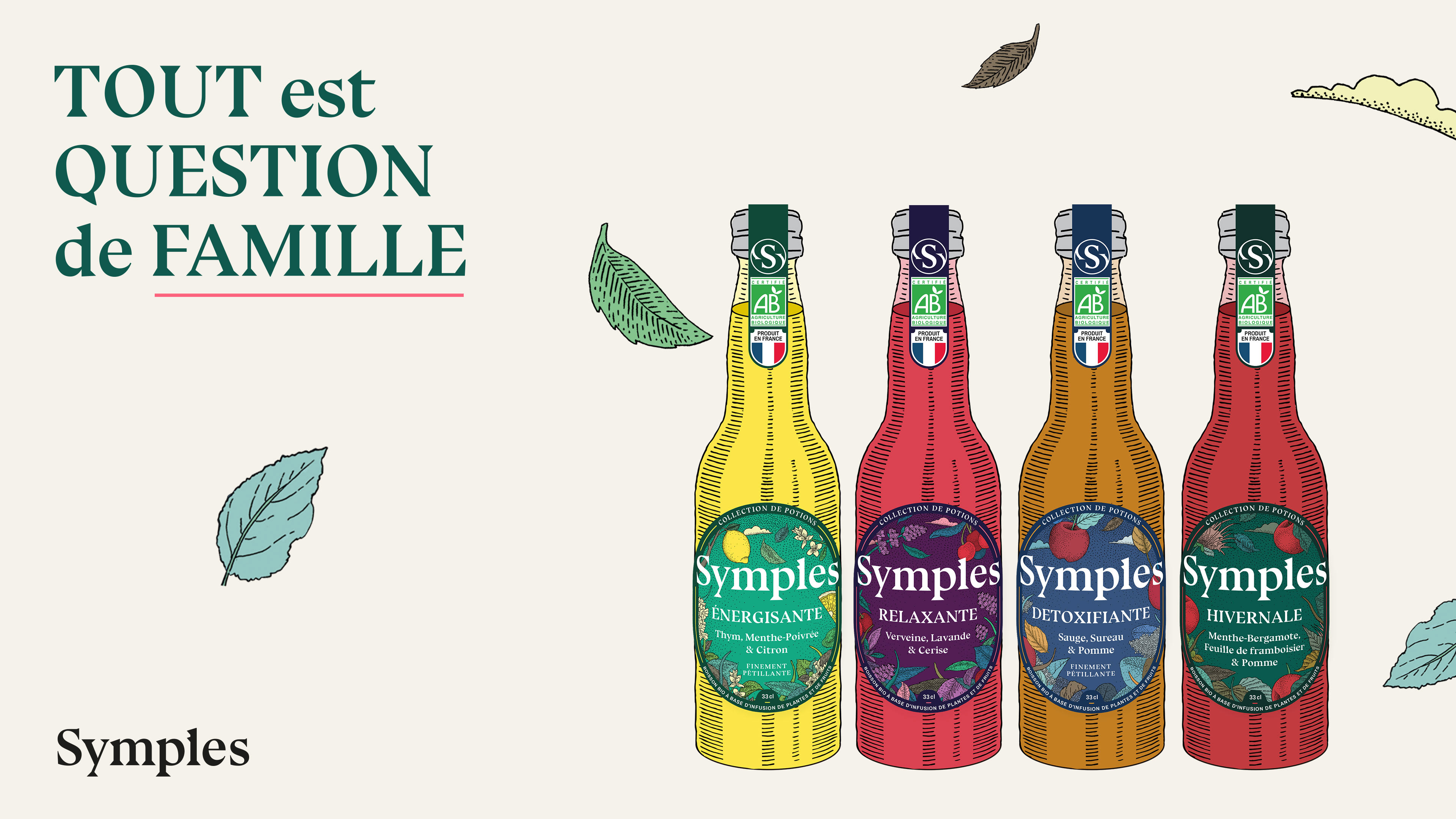

The French recipe
is reborn
The context
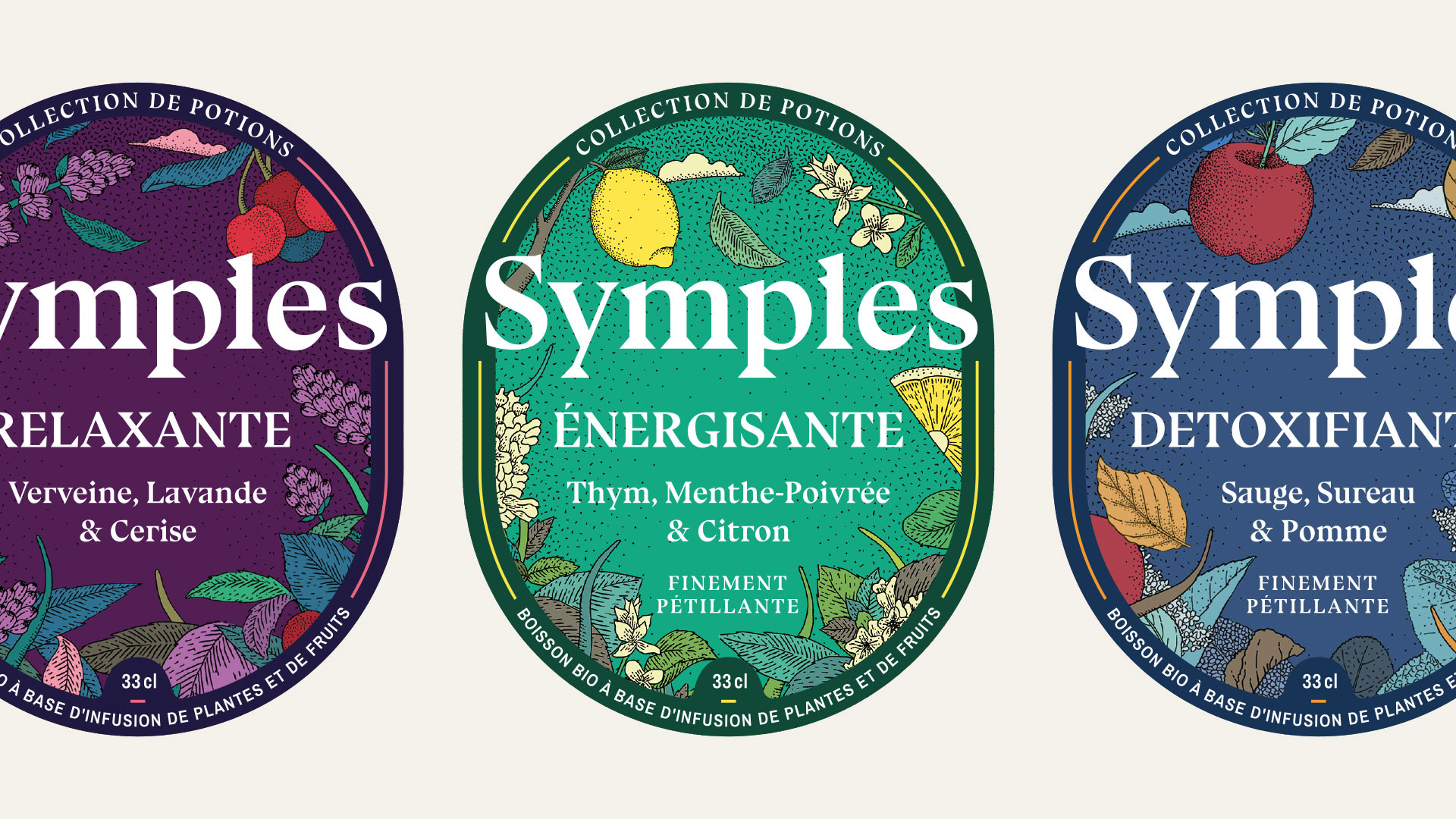
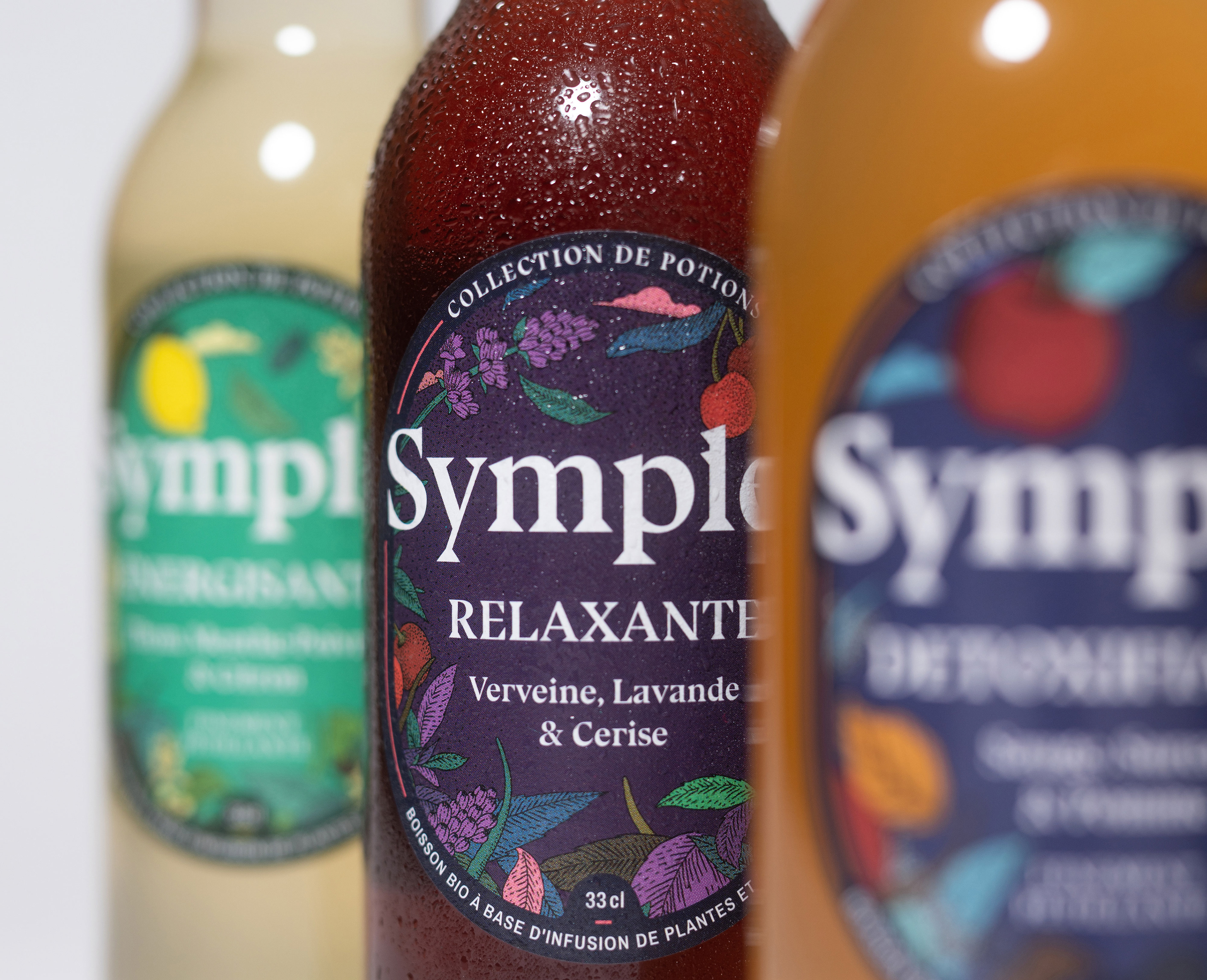
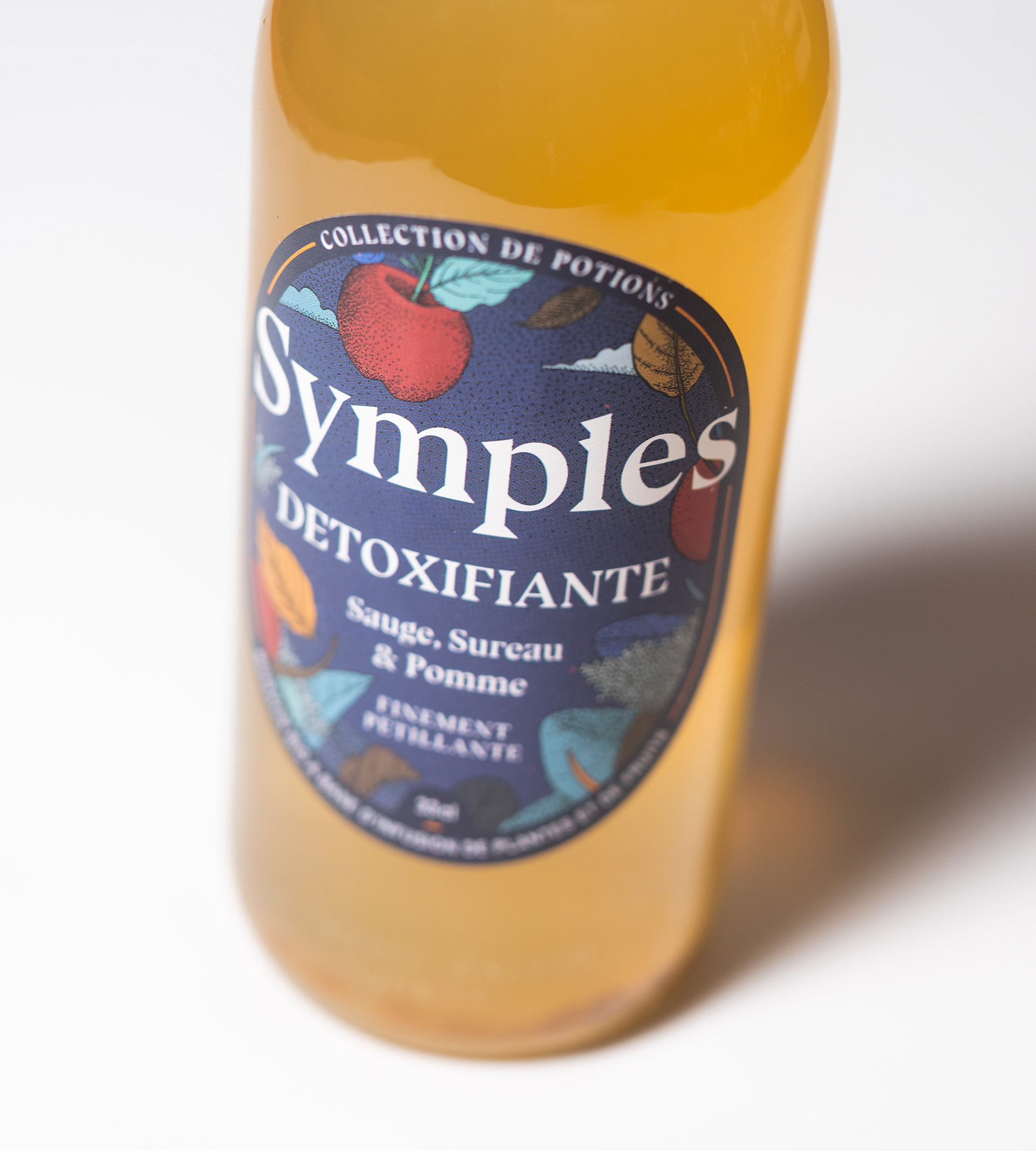
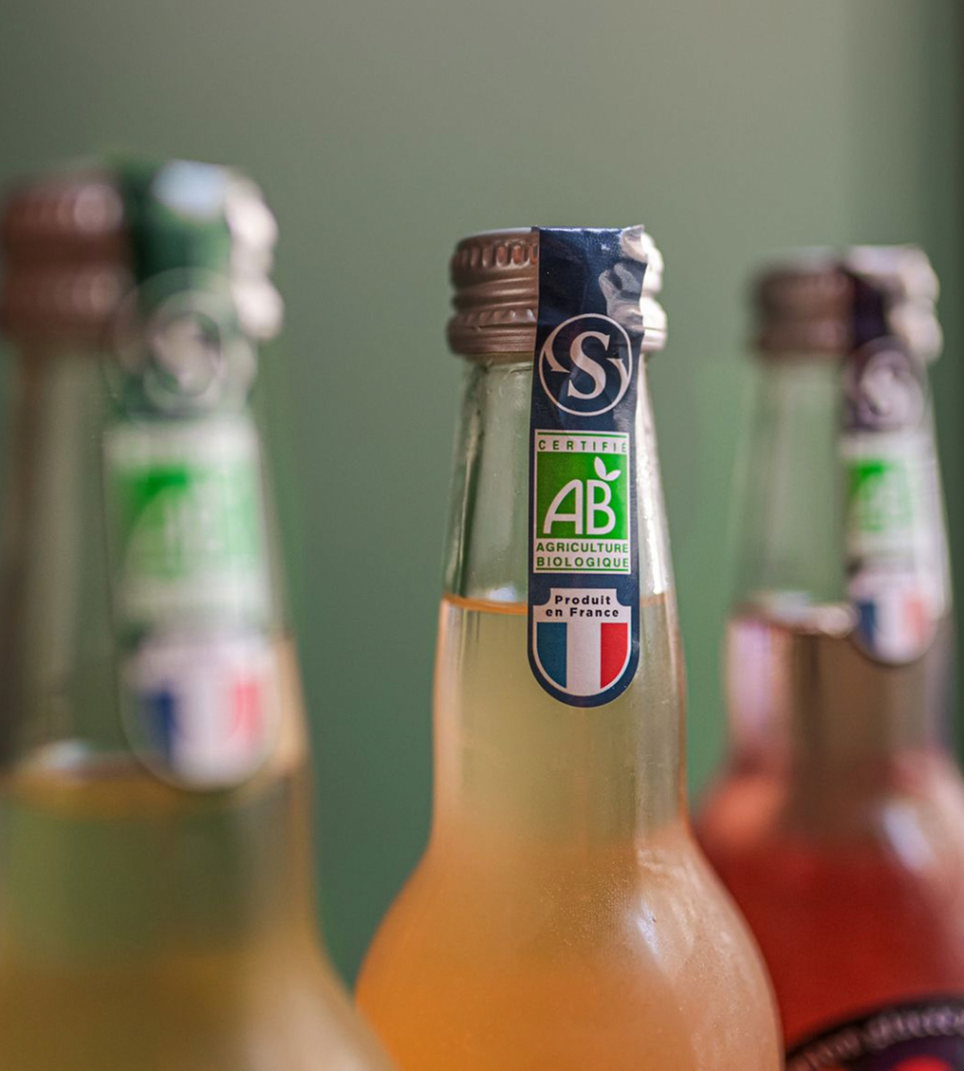
A beverage not seen in the usual market: 100% natural, infused with ancestral plants and Made in France. Théo and Florent contacted us to work on the redesign of the labels for their drinks, to represent the brand's values and highlight them in that market.
Goals
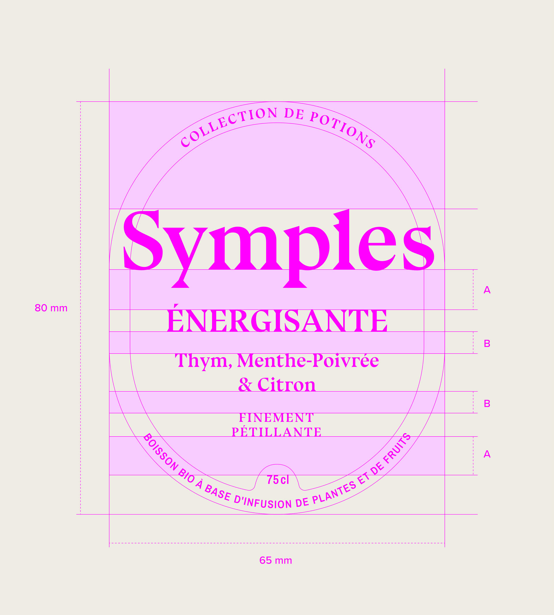
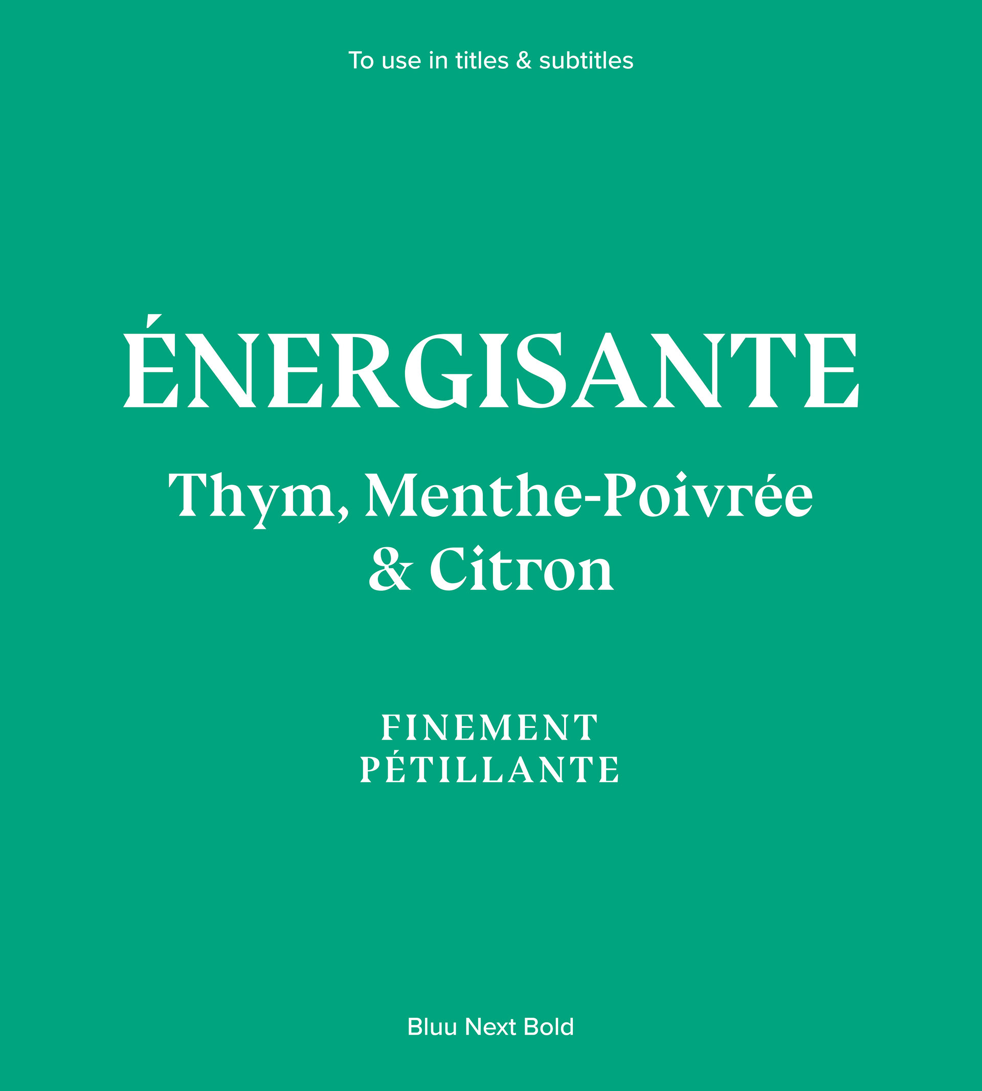
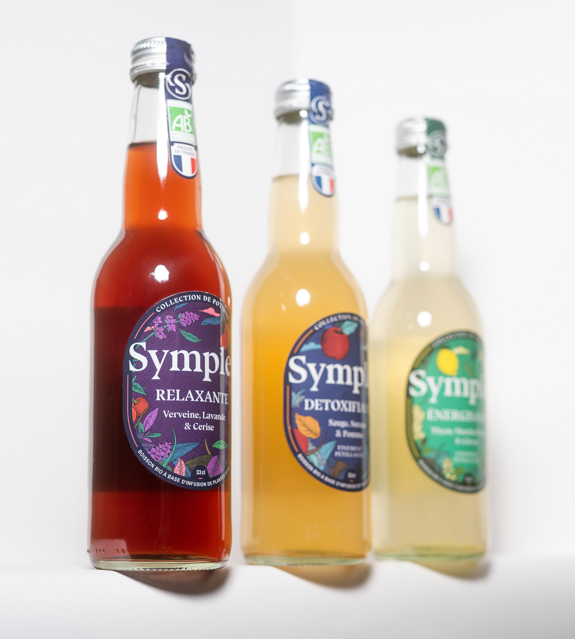
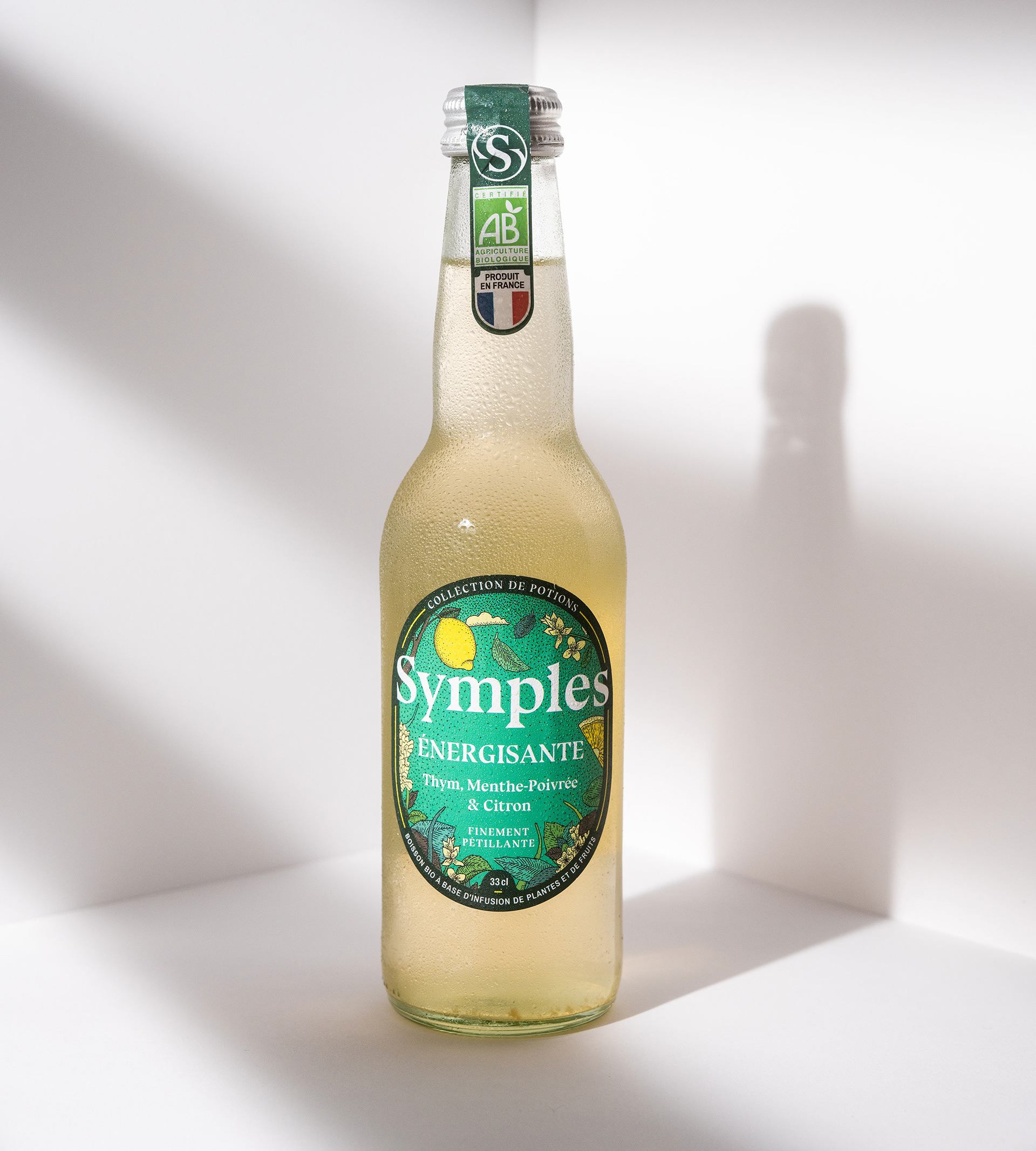
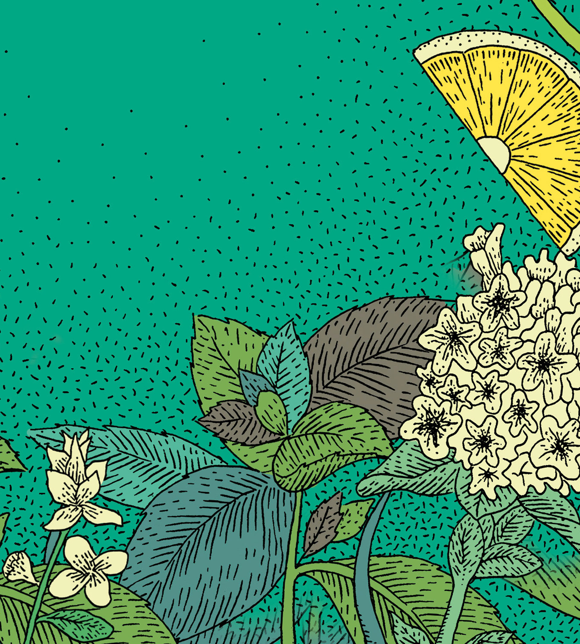
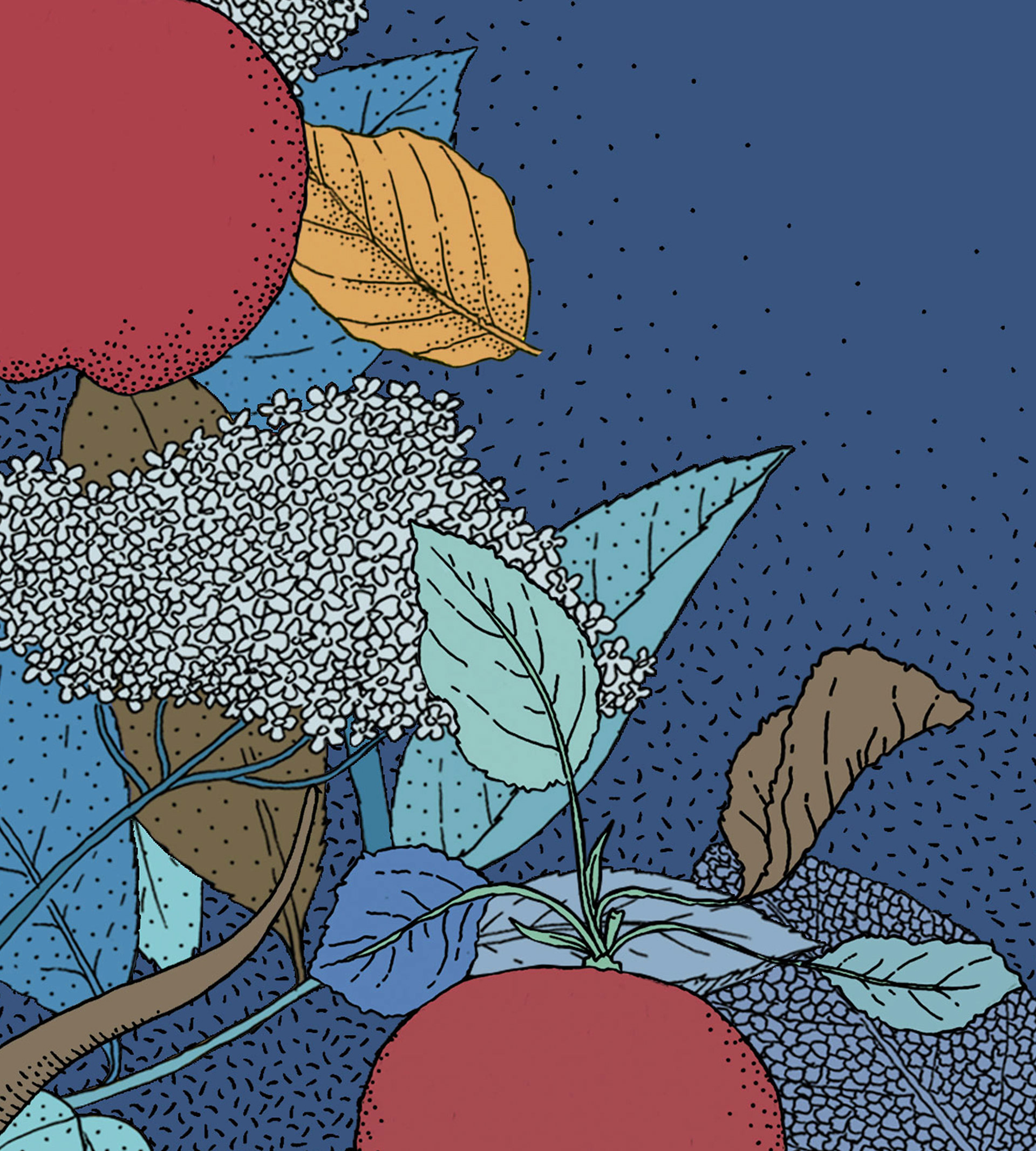
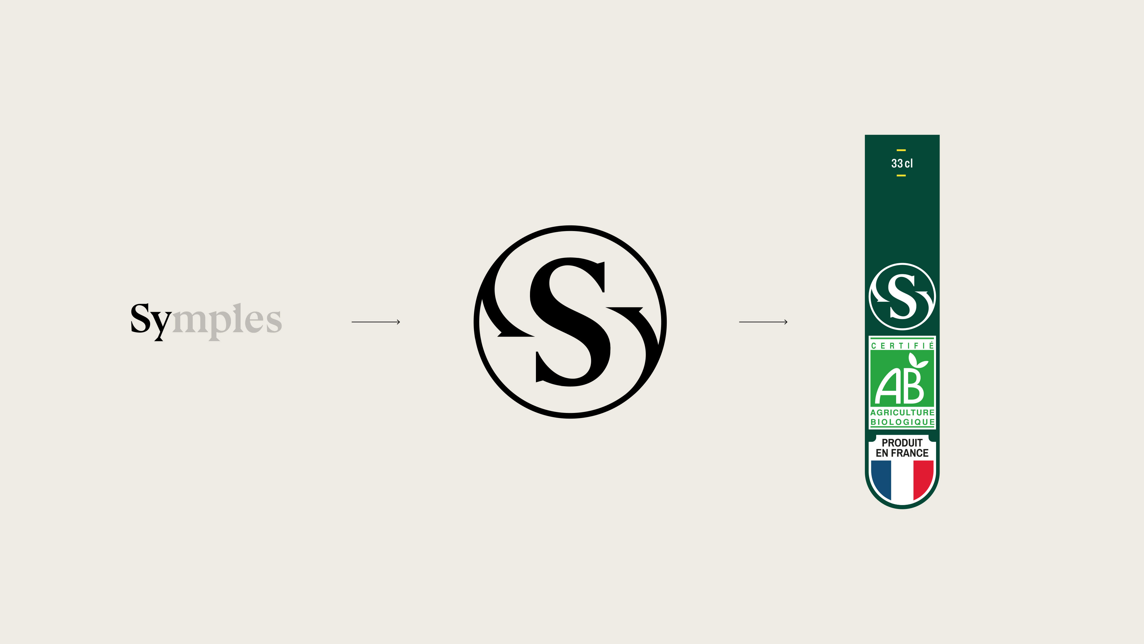
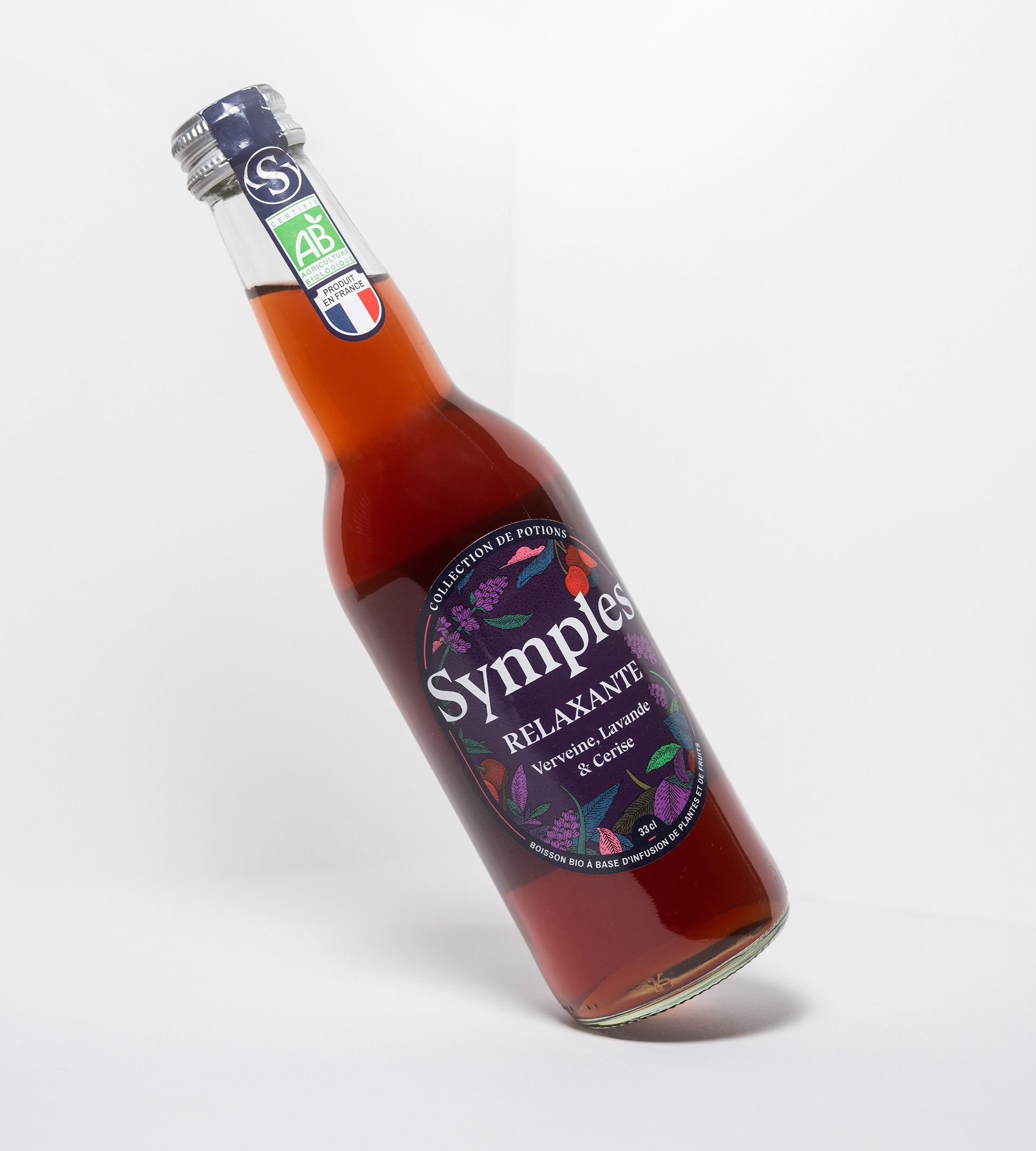
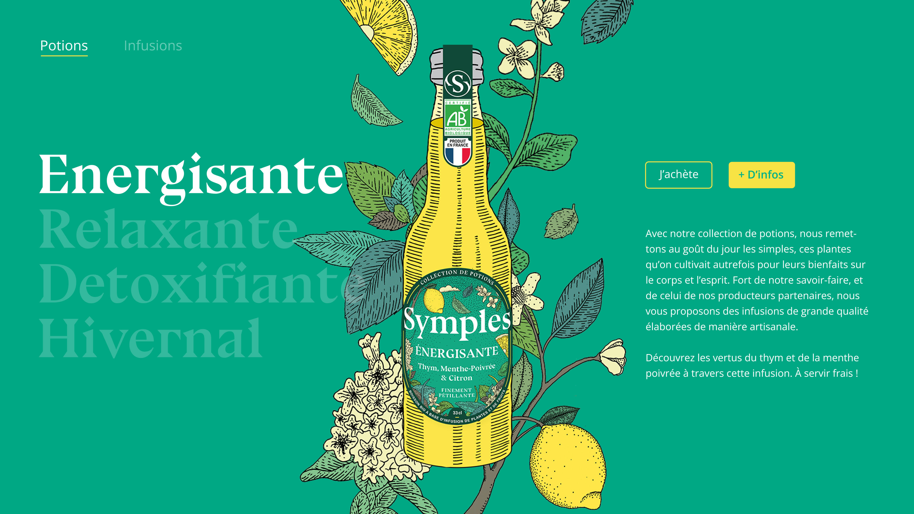
The redesign of the visual identity continues around the concept of "Simples", plants grown by their ancestors in the past in gardens and monasteries for their therapeutic and aromatic virtues. The result we obtained represented the idea of the author’s work, linked to the work of art as a unique and unrepeatable creation, both in the recipe of the drink and in the label that represents it.
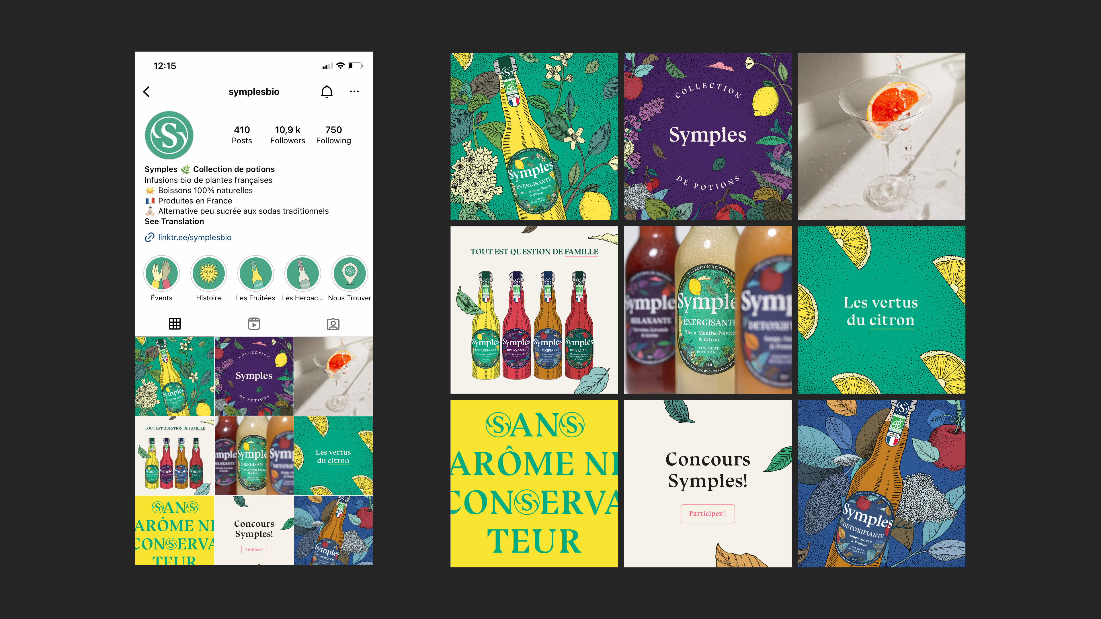
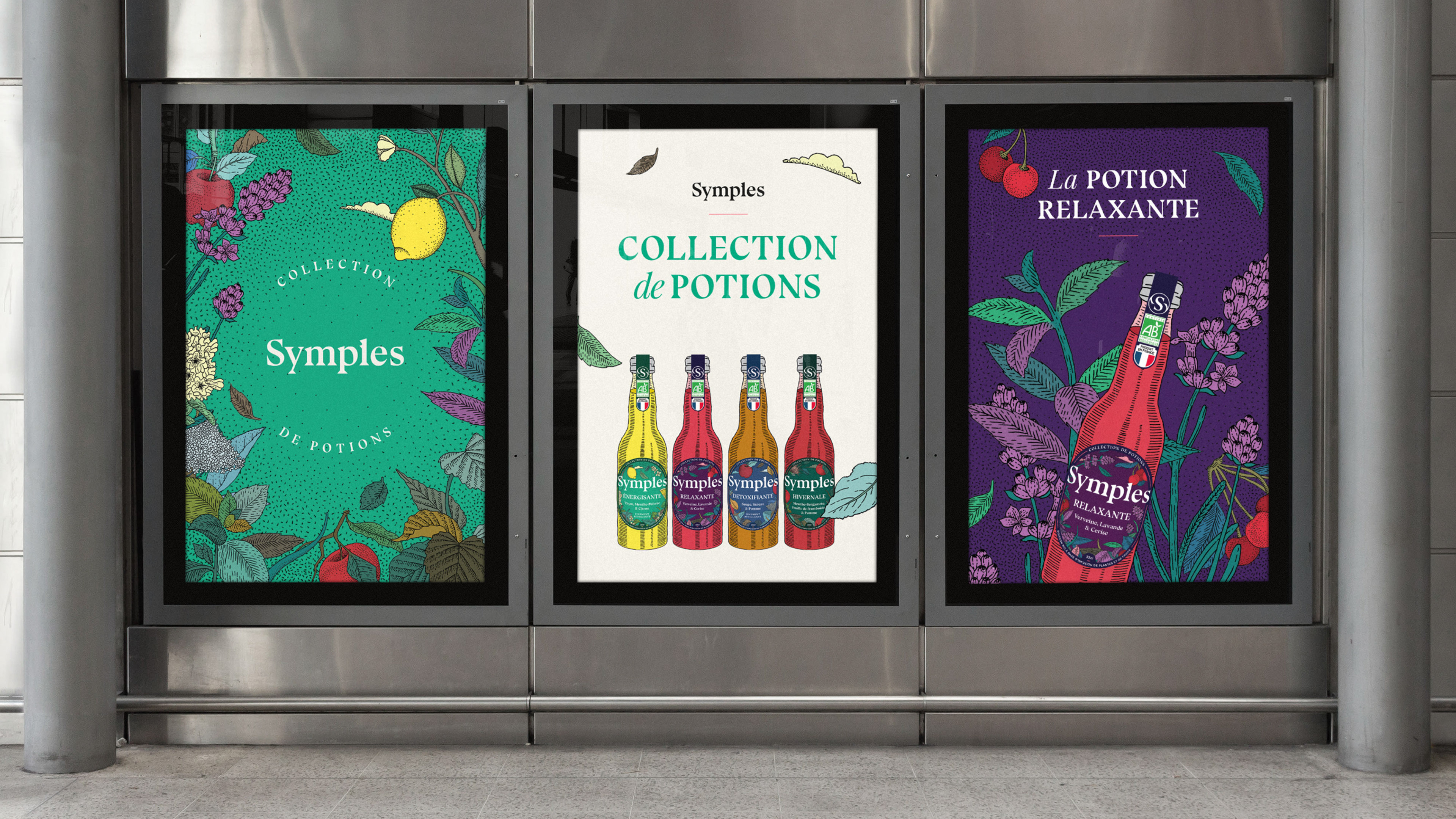
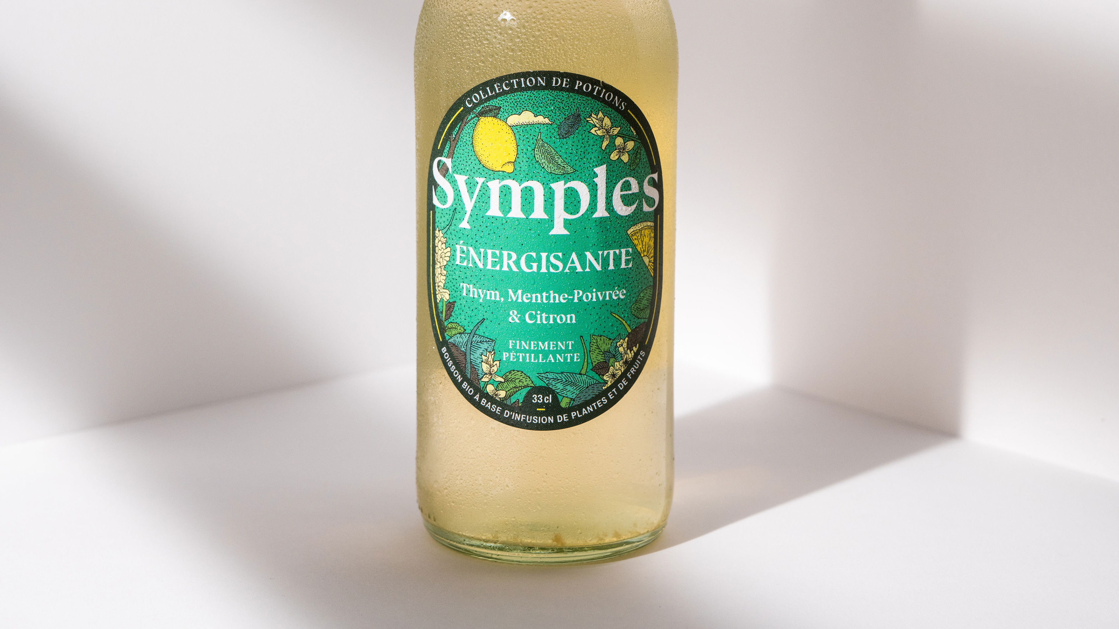
What we did
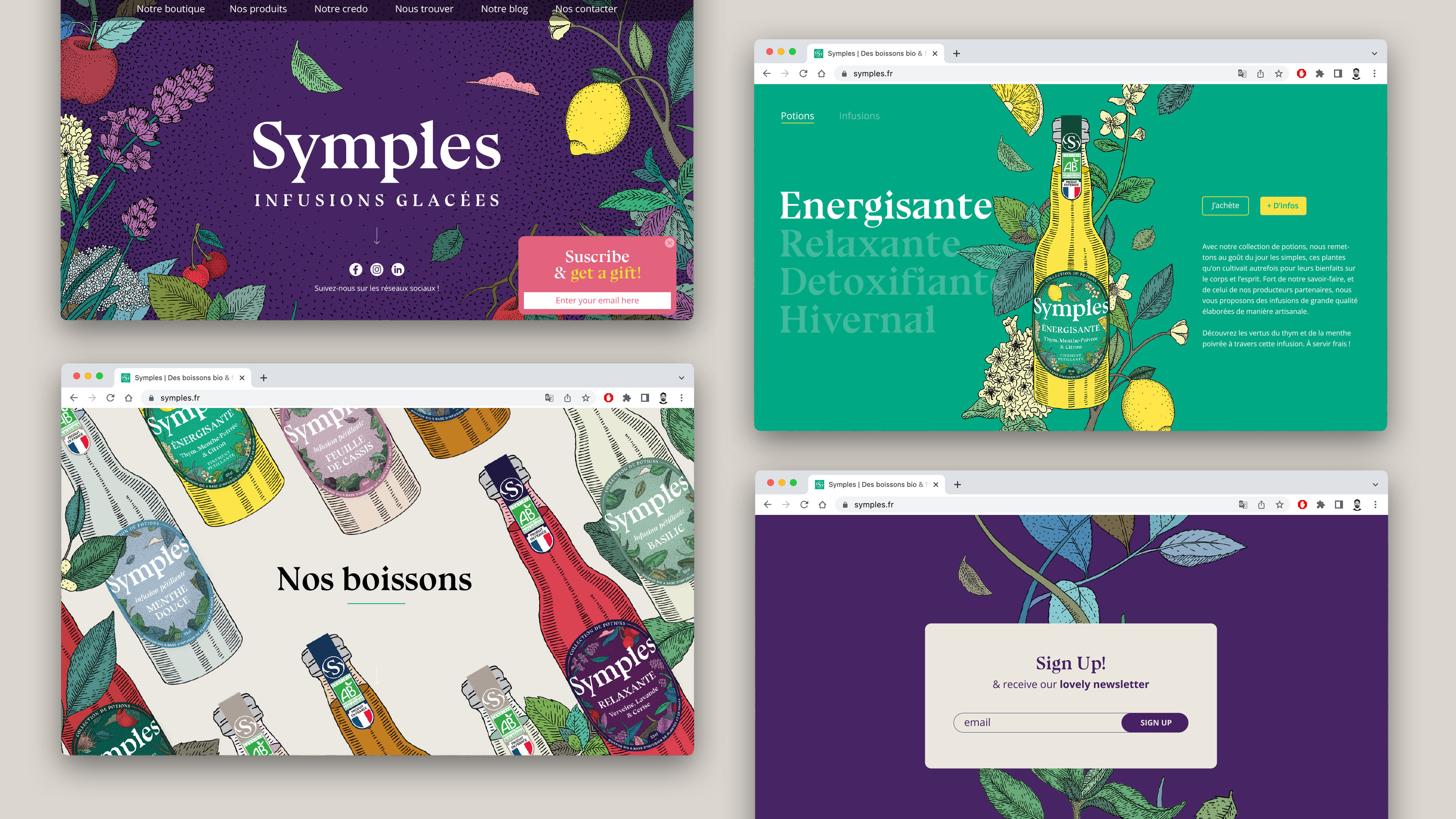
Brand Identity
Visual Language
Illustration
Packaging
Print Digital
The impact we supported
Growth in 4 years
+ From 2 to 10 people working
+ 40 to 2500 points of sale, all over France
+ Selling hundreds of thousands of bottles per year
+ More than 10K on instagram
+ More than 1 TON of plants used since the beginning